The ANRT is a site of excellence where specific expertise is developed in the fields of typographic and editorial design. It is intended to guide personal research projects submitted each year by its candidates. At the same time, permanent lines of research were defined: they give rise to specific research programs, related to these issues, established with partner organizations. Type design is always at the center of the process.

The World’s Writing Systems

Nearly half of the world’s writing systems (133 out of 292, at present) are not encoded, and therefore cannot be accessed on computers or smartphones. Excluded from the digital world, these scripts (living or ancient) are threatened with extinction. To support and preserve this diversity, ANRT and Johannes Bergerhausen (University of Applied Sciences in Mainz, Germany) support the work of the Script Encoding Initiative (Berkeley UC) to integrate these extinct or minority scripts into the Unicode standard, and give them a typographic form, often for the first time.

The Missing Scripts Unencoded writing systems

The Missing Scripts research program was initiated in 2016, in partnership with the Designlabor Gutenberg at the University of Applied Sciences of Mainz (Germany) and the Department of Linguistics of Berkeley UC.

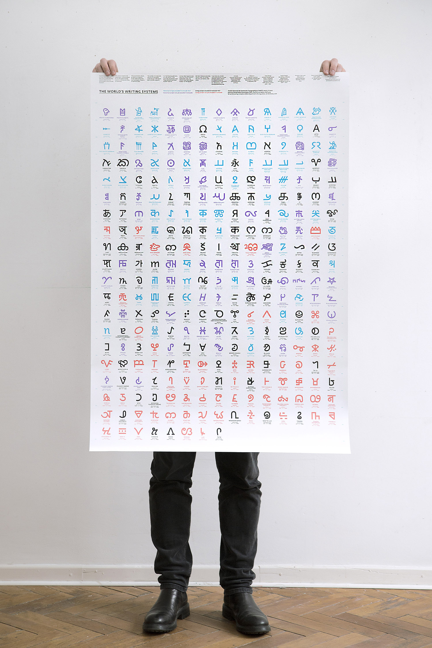
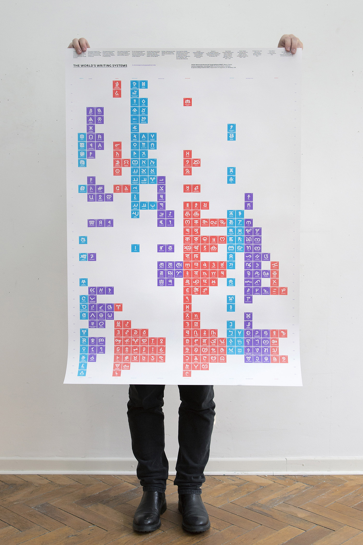
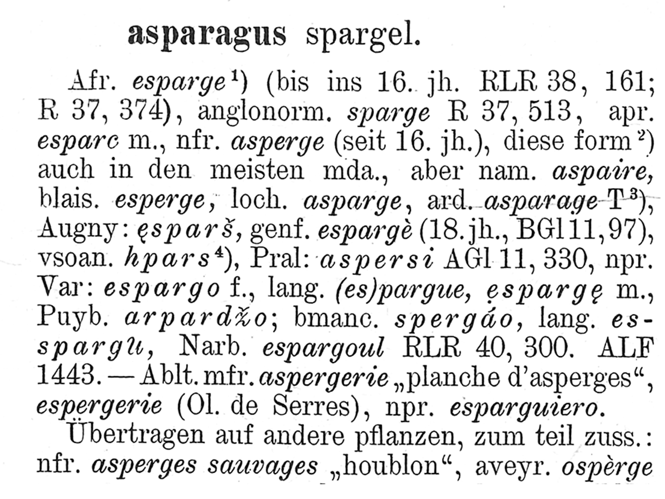
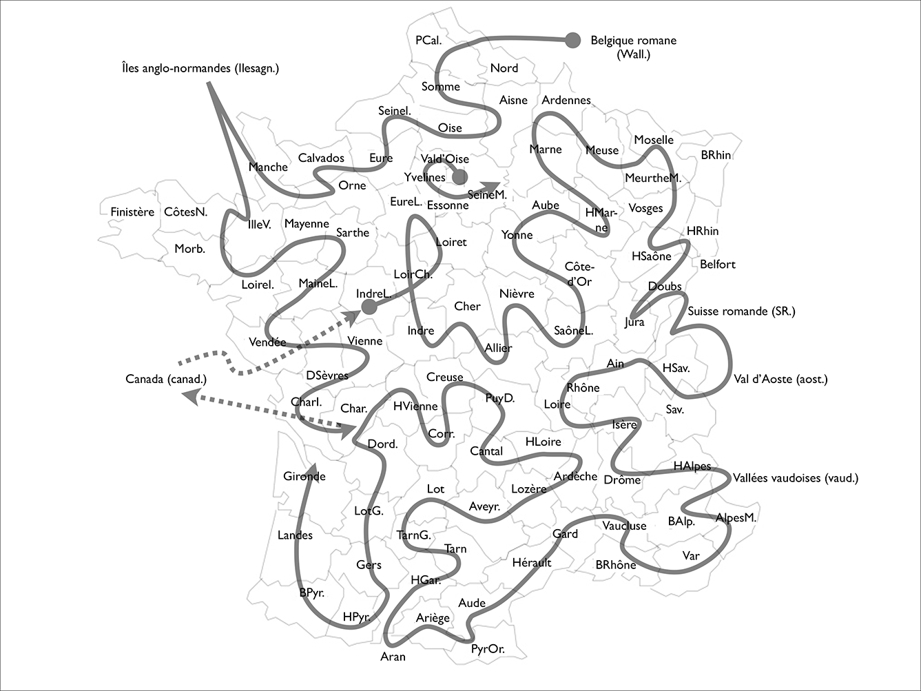
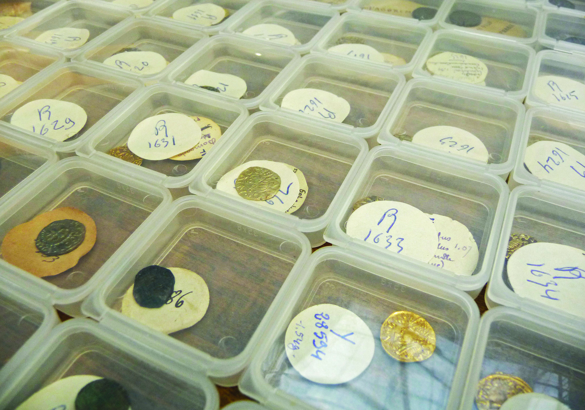
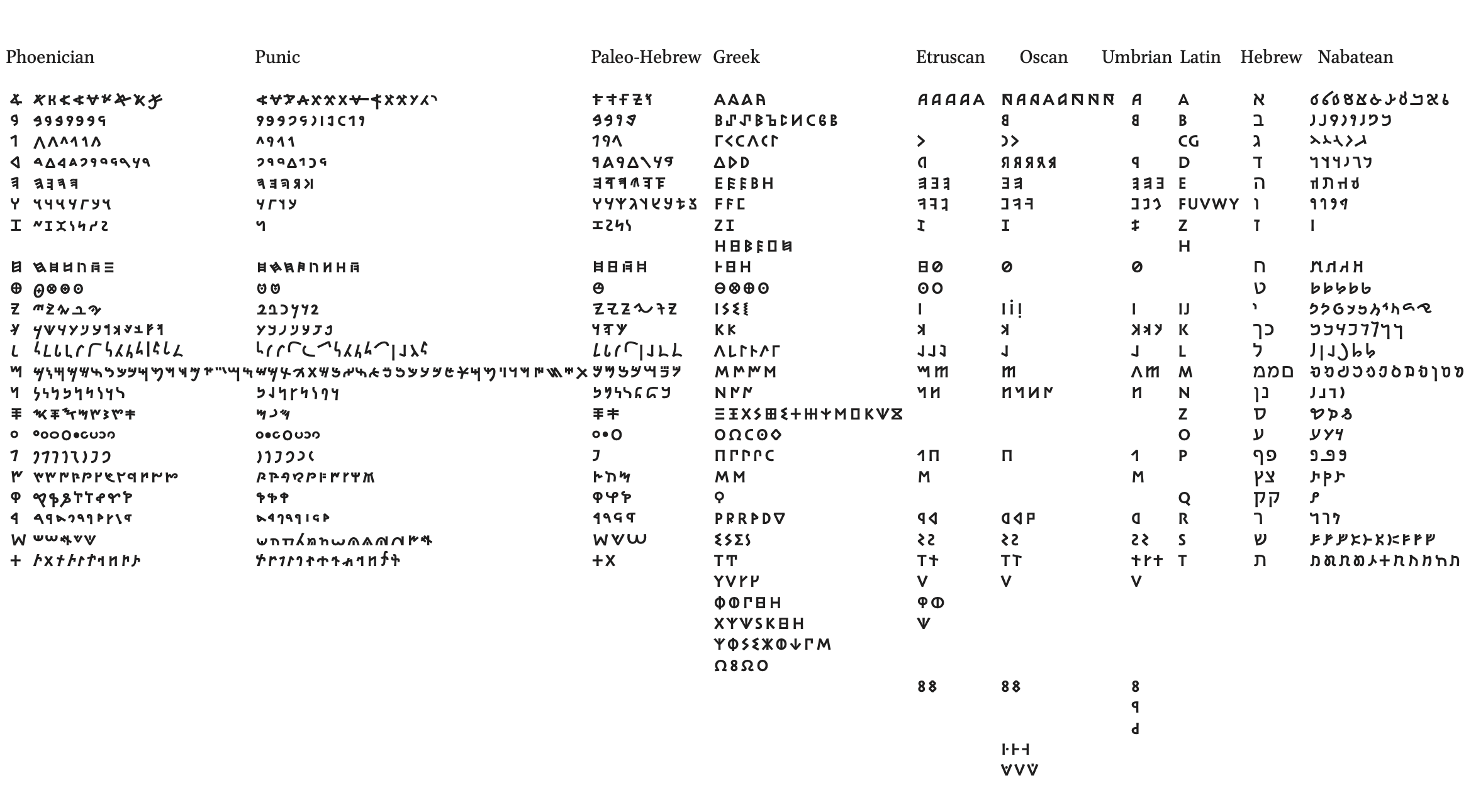
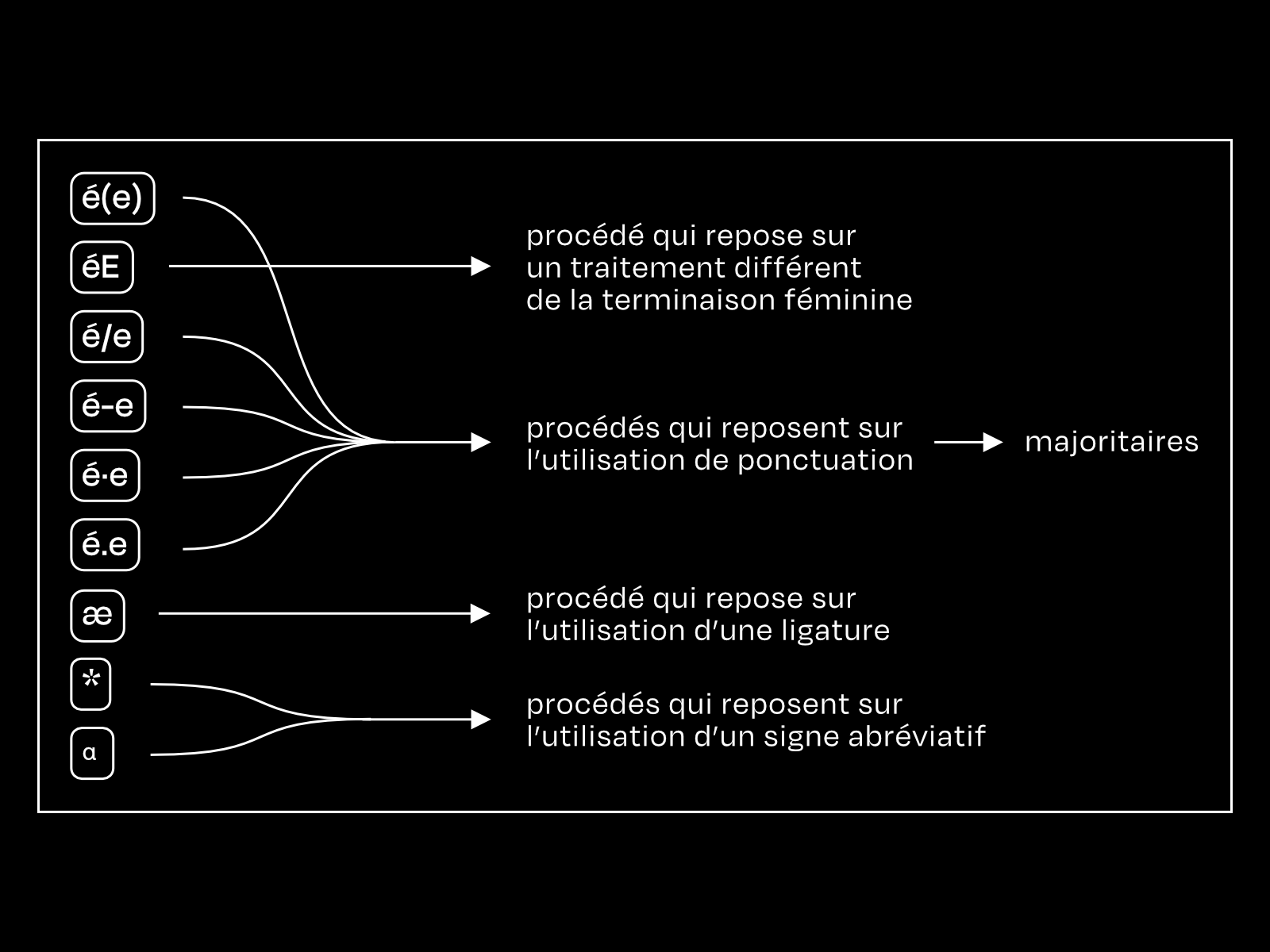
Almost half of the world's scripts are not encoded in the Unicode standard, and therefore are not accessible on computers or smartphones (146 out of 292 in 2016, 133 out of 292, to date). Excluded from the digital eco-system, these scripts (living or ancient) are threatened with extinction.

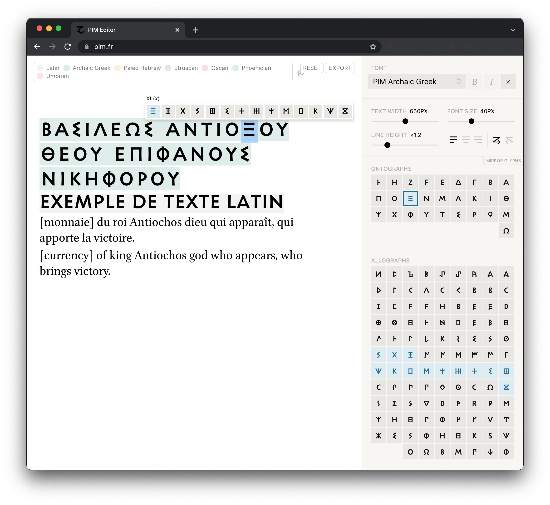
To support and preserve this diversity, the ANRT accompanies the work of the Script Encoding Initiative (Berkeley UC) to integrate these extinct or minority scripts into the universal Unicode standard, and give them a typographic form, often for the first time. These fonts, developed with experts and scripters of each script, are often technically and scientifically challenging, and may take several years to develop.

Johannes Bergerhausen, designer and professor at the designlabor Gutenberg of the Hochschule Mainz, created the poster and website The World's Writing Systems from the glyphs designed at ANRT for the Missing Scripts, and the Decode Blockdock designed by Jérôme Knebusch. Published by the ANRT, this poster is updated regularly: the 3rd edition was published in 2021.

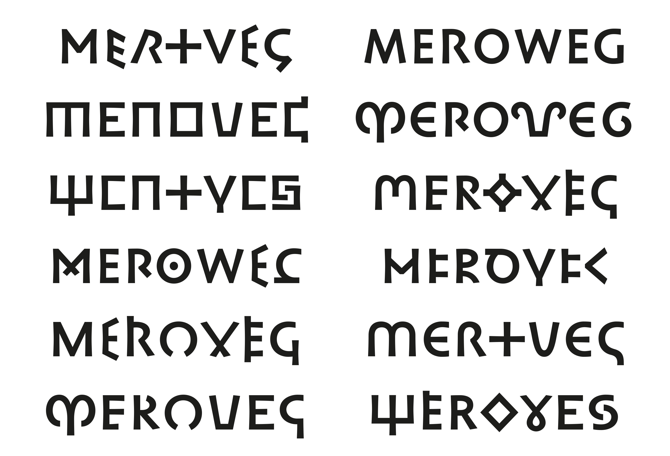
Each year, ANRT students develop digital fonts for newly encoded or about-to-be encoded scripts. This work contributes to the preservation and development of typographic expertise for these minority, living or disappeared scripts.

Partenariats

Hochschule Mayence
Institut Designlabor Gutenberg, Mainz (DE)
Professeur associé: Johannes Bergerhausen

University of Berkeley
Berkeley, CA 94720-2650 (USA)
Dept. of Linguistics 
Script Encoding Initiative
Professeur associé: Deborah Anderson

Typography and digital humanities

The development of digital humanities has given rise to new typographical problems, linked to the recognition, tagging, encoding and visualization of large quantities of textual data. To enable the transcription of complex notation systems, ANRT has developed several research programs in relation to various disciplines.

FEW Typography and Lexicography

Walter von Wartburg’s etymological dictionary of French, the Französisches Etymologisches Wörterbuch (FEW), is “a representation of the Gallo-Roman lexical treasure.” More than five million entries, spread over 16,000 pages and 25 volumes, set up the history of words, their semantic and morphological evolution.

The phonetic transcriptions are notated by means of a unique notation that makes use of multiple diacritical marks. To make possible the retro-conversion of the FEW into a digital form, Sarah Kremer developed a family of custom typefaces (Walther), a principle of page layout, and two interfaces: the first guides writers during the creation of new articles, the second allows users to consult and to interact with the FEW’s computerized database.

The outcome of a collaboration between linguists, software engineers, and designers, this program was initiated in 2013. It was pursued as part of a doctoral dissertation, “The Material Realization of the ‘Französisches Etymologisches Wörterbuch’: The Impact of Typographical Formatting on the Development of a Lexicographical Project”, defended by Sarah Kremer in 2018. It is the first dissertation co-supervised by the ANRT.

Partenariats

ATILF (Analyse et Traitement Informatique de la Langue Française / CNRS)
Nancy
Professeur associé: Yan Greub, directeur du FEW (Französisches Etymologisches Wörterbuch), dans le cadre du projet FEW. 
atilf.fr

PIM Typography and Numismatics

As with other fields of epigraphy, the semantic content of monetary captions is, in general, not their sole interest. The graphic particularities of signs—letters or symbols—from which they are composed also carry meaning and provide essential information for understanding the object: the geographical, chronological, technical, and cultural context of its production, its usage, and its reception.

The research program Police pour les Inscriptions Monétaires (PIM) [Font for Monetary Inscriptions] was initiated in 2014, with the Department of Currencies, medals, and antiques at the BnF, which houses nearly 100,000 items. The goal is to produce a set of fonts directly transcribing the diversity of inscriptions. Hundreds of glyphs were drawn to transcribe the ontographs (reference signs) and the allographs (stylistic variants of these signs) identified in the collections. First developed by Elvire Volk Leonovitch for the collection of Merovingian coins (2014-2015), the typographical tool was expanded upon by Morgane Pierson beginning in 2018 to include ancient coins, bringing together 12 systems of writing: Phoenician, Punic, Cypriot, Archaic Greek, Etruscan, Umbrian, Oscan, Paleohispanic, Lycian, Paleo-Hebrew, Kharoshthi, and Nabataean.

Partenariats

En collaboration avec le Département des monnaies, médailles et antiques de la Bibliothèque nationale de France (BnF), l’Institut de recherche sur les Archéomatériaux (IRAMAT) et le Centre d’Études Supérieures de Civilisation Médiévale (CESCM), dans le cadre du plan triennal 2013-2015 et du plan quadriennal 2015-2019 de la recherche de la BnF. Projet mené avec Florence Codine-Trécourt (PIM 2013-2015) et Frédérique Duyrat (2015-2019).

VEGA Typography and Egyptology

In autumn of 2015, a partnership with the ANRT is initiated for the typographical development called VÉgA (Vocabulaire de l’Égyptien Ancien or Vocabulary of Ancient Egyptian), a digital tool intended to replace the Wörterbuch der Aegyptischen Sprache of the Academy of Berlin (1925-1931), which has become obsolete. The program brings together the teams of the LabEx ARCHIMEDE (Université Montpellier 3) and of Intactile Design.

The difficulty consists in integrating not only the most complete set of hieroglyphs (1200 in Unicode, but more than 9000 necessary for setting every form of ancient Egyptian), but also their different written forms in ancient Egyptian. The written forms correspond, in a way, to the spelling of words: one regularly encounters twenty or so different written forms for the same word.

Led by Pierre Fournier (ANRT 2015), this project has been ongoing since 2019 as part of a doctoral research project. In it, he analyzes the evolution of the methodological tools of Egyptology: the printing of hieroglyphic typeface at the Imprimerie Nationale (1842-1852), Gardiner’s Sign List (1927), and the first computerized typefaces in the 1970s-80s.

Partenariats

Université Paul Valéry / Montpellier 3
LABEX Archimede «Archéologie et Histoire de la Méditerranée et de l’Égypte anciennes» – et par le laboratoire «Archéologie des sociétés méditerranéennes», unité mixte de recherche (UMR 5140), dans le cadre du projet ANRT/VEGA vega-vocabulaire-egyptien-ancien.fr

Thèse de doctorat en co-direction: Design, sous la direction du Professeur Alessandro Zinna (UPR Projekt, Université de Nîmes) / Égyptologie, sous la direction du Professeur Frédéric Servajean (LabEx Archimede, Université Paul-Valéry Montpellier 3)

SIGILLA Typography and Sigillography

Sigilla is a data base that makes it possible to collect and to provide researchers with access to the totality of collections of seals preserved in France: more than 100,000 entities are currently listed. Since 2020, at the ANRT Délia Préteux has been developing a dedicated typeface for the transcription of sigillographic captions. Epigraphy of seals spans a very expansive period, which entails great stylistic variety. The inscriptions are brimming with abbreviations, symbols, ligatures and other whims of engraving. Moreover, the materiality of the prints, affixed in wax, gives rise to variations in form. Between the structural, morphological assessment of the letter and the singularity of each source, what level of detail is to be adopted for transcribing sigillography?

Partenariats

Sigilla is a consortium which brings together EPHE, CESCM, Centre de recherches archéologiques et historiques anciennes et médiévales (CRAHAM) Caen-Normandie University,  Centre de recherche universitaire lorrain d’histoire (CRUHL) Lorraine University, ARCHE laboratory - Strasbourg University, Institut de recherche et d’histoire des textes (IRHT) - CNRS, École nationale des Chartes (ENC), Archives nationales and the Service interministériel des archives de France (SIAF).

History of typography

Gotico-Antiqua, Proto-roman, hybrid XVth Century Typefaces between Gothic and Roman

This vast research program explores a period in the history of typography that, relatively speaking, is not often studied: after Gutenberg and before the Jenson model was stabilized. The body of work study extends back to the first humanistic tendencies toward “pure” romans, by way of many cases of uncertain designs, voluntary hybridizations, or archaic forms of roman. Undertaken between 2016 and 2020 and coordinated by Jérôme Knebusch, Gotico-Antiqua led to 11 workshops in France, in Germany, and in Italy. From Mainz to Rome, this program led to the creation of 15 previously unseen digital fonts based upon historical models, two exhibitions, an international conference in Nancy in April 2019, and the publication, in 2021, of a significant book that brings together the conference proceedings and the exhibition catalog.

Baskervville A revival’s revival

Claude Jacob was punchcutter, trained in Birmingham by John Handy, who cut John Baskerville’s types. Employed by the Société littéraire et typographique de Beaumarchais, he was sent to Birmingham to supervise the acquisition of Baskerville’s punches from Sarah Eaves, his widow and legatee, for the edition of Voltaire's complete works in Kehl. He then worked in Strasbourg, at the end of the 18th century, before his typefaces, strongly inspired by those of the English master, became the property of the Levrault foundry, then of Berger-Levrault: they were then qualified as typefaces “in the style of Baskerwille” (with a w).

The typefaces of Jacob, “understudy” of Baskerville, had disappeared. They served as models for the 2017 class of the ANRT who collectively designed the Baskervville (with 2 v) fonts, now released under open-source license.

Frutiger Archives 1963-1975

Since 2021, the ANRT is hosting in Nancy an exceptional archive of works by Adrian Frutiger: these unpublished documents cover the period 1961-1975 in the Atelier Frutiger (then Frutiger+Pfäffli) at the Villa Moderne in Arcueil. Composed of manuscripts, sketches, technical drawings, correspondence, photographs, this documents will join the Frutiger archives of the Museum für Gestaltung in Zürich at the end of the project.

Partenariats

Supervised by the ANRT team and Anne-Lyse Renon, visiting researcher at ANRT (Maître de conférence en Design graphique, Laboratoire Pratique et Théorie de l’Art Contemporain, EA 7472, Université de Rennes 2 / Membre associée, Centre Alexandre Koyré, UMR 8560, EHESS-CNRS-MNHN / Bibliothèque nationale de France - BnF ANR DESIGNSHS)

Dossier Scriptorium 1967-2005

In 1967, within the École des beaux-arts, the architect and painter André Vernette created the Scriptorium de Toulouse, a workshop of typographical and calligraphic creation. The first class trained, among others, Bernard Arin, François Boltana, and Claude Mediavilla. Closed in 1973, it reopens in 1982 under the supervision of Bernard Arin, then closes once again in 1985: in 1987, it becomes a private course, offered at Arin’s home until 2005. Over the course of this eventful history, the “Scripto” trained many creators (several of whom later joined the ANCT / ANRT) and made a lasting mark on the landscape of French typography.

In 2017-2018, Juliette Flécheux, a student at the Toulouse school of fine arts (ISDAT), begins researching this pedagogical adventure for her thesis project for which she collects a great number of testimonies. She goes on to purse this work between 2019 and 2021 at the ANRT, until she publishes “Dossier Scriptorium, A pedagogy of the written and drawn letter: History, testimony, transmission” with the Éditions deux-cent cinq publishing company (2022).

Exceptionally documented, the book takes a look at the humanist pedagogy of Bernard Arin, who suddenly passed away in August 2019.

ANRT Archives 1985-2006

Since the ANRT’s reopening in fall 2012, work has been undertaken to shine light on the archives from the period 1985-2006. An immense digitization campaign was carried out (9000 images in total), which led to the publication of the book ANRT Archives 1985-2006, whose page layout was done by Huz & Bosshard.

Through more than 650 images drawn from never before seen archives, this book represents the history of the Atelier for the first time: the context of its creation and its first twenty years of activity, over a period marked by profound technological transformations. This history, told by Sébastien Morlighem (for the period 1979-1991) and Roxane Jubert (1991-2006), is followed by a large selection of projects, which attests both to an age-old craft and to the most radical innovation. In it, one finds works of research by  André Baldinger, Bruno Bernard, Peter Biľak, Johanna Balušíková, Thomas Braichet, François Chastanet, Matthieu Cortat, Serge Cortesi, Yoan De Roeck, Marco Godinho, Sébastien Gouju, Margaret Gray, Thomas Huot-Marchand, Franck Jalleau, Roxane Jubert, Jérôme Knebusch, Laurent Kuhni, Alejandro Lo Celso, Didier Mutel, Muriel Paris, Jean François Porchez, David Poullard, and many others.

Typography and learning

Research carried out at the ANRT frequently explores the relationship between typography and language, learning forms, and writing in all its forms.

Prélettres Learning Handwriting in Preschool

Since 2013, at the ANRT, Éloïsa Pérez has been developing typographical research devoted to the learning of handwriting in preschool. Her work defends education through doing, through action and practice as the dynamics of learning and of research. In the style of Bruno Munari’s “prebooks,” the Prélettres apparatus is comprised of tools for the material discovery of the letter, which invite modular manipulation and arrangement. Their conception was guided by usages observed in preschool classes during pedagogical workshops, which were set up in several public schools throughout the research process and which made possible the apparatus’s gradual formulation, supported by a repertoire of forms adapted to identified childhood practices and their natural development. Prélettres is being developed in a variety of formats and scales: manipulable modules, normographs, furnishings, a tablet app, and a digital font. A complete typographical universe, so that the youngest children can learn.

Partenariats

Thèse de doctorat menée au sein de l’École des hautes études en sciences de l’information et de la communication (CELSA, Université Paris-Sorbonne). Travaux dirigés par Emmanuël Souchier (CELSA), co-encadrés par Charles Mazé et Thomas Huot-Marchand (ANRT), depuis octobre 2016. Date de soutenance envisagée : 1er trimestre 2023

Borel Learning to Read, Learning to Write

How is one to think about typography in relation to the combined learning process of reading and of writing? Developed with primary school teachers and speech pathologists, Rosalie Wagner’s work seeks to reconnect the signs that one learns to read with those that one learns to write. Two typefaces were drawn within this logic in order to establish a continuity between cursive drawing and typographical form. Borel Sans and Borel Cursive (named in homage to Suzanne Borel-Maisonny, a pioneer of speech pathology) are quite robust, with low contrast and a large x-height. The letters are open and quite distinct, in accordance with the rules of cursive writing in French schools. A harmonious use of the two typefaces in pedagogical documents is made possible by their shared characteristics: width, proportions, alignments, and ductus.

Exposer la dislexie An online tool to understand dyslexia

Formulating a clear definition of dyslexia runs up against the great variability of symptoms and of profiles of dyslexic people. In an attempt to figure out what it means “to be dyslexic,” from 2018 to 2020, Sofie Gagelmans performs a large number of interviews, and develops an online tool that visually simulates what a dyslexic person sees when he or she tries to read a text. Other variables, such as the complexity of a word, its size, and the kind of font used, can be adjusted. Rather than purporting to resolve dyslexia through the creation of a typeface, Sofie Gagelmans uses dynamic typographic means (variable fonts, augmented reality) in order to make understandable the difficulties that dyslexic people face in everyday life

Adelphe Gender and Typography

Inclusive writing refers to the set of deliberations that aims to ensure equality in the representation of genders. In terms of typography, several devices coexist. Between 2020 and 2022, Eugénie Bidaut creates Adelphe (which means both brother and sister, in a non-gendered way), a typeface that offers three different ways to practice inclusive writing: Adelphe Germinal, which uses the middle dot, Adelphe Floréal, in which subscript diacritical marks leave a mark on the first letters of masculine and feminine endings, and Adelphe Fructidor, which combines the usage of an alternative form of “e” with ligatures. These fonts are distributed by the type collective Bye Bye Binary, which offers many inclusive typographical forms (mutant letters, ligatures, symbiotic elements), and develops encoding solutions with the Queer Unicode Initiative (QUNI), in order to make it possible for a broad public to use them.